If you want to create products that work for different groups of customers, you need to stick to the six crucial commandments of inclusive design. This way, your products will be fully functional and intuitive to use for different users. But what are these commandments? And how does inclusive design differ from universal or accessible design? Let’s have a look.
As we probably all know, inclusive design is an approach to designing products/apps/services that asserts there are no “typical” or “standard” users and that whatever you design should be adjusted to people with different preferences, needs and capacities. First, I wanted to show you, how this is different from accessibility and universal design.
Inclusive design vs. accessibility and universal design
At the start, these three terms might seem similar, but they have some differences. Accessibility aims at creating products that can be used by users with various disabilities – physical or cognitive. To help these users consume web content without any problems, web developers and designers stick to Web Content Accessibility Guidelines (WCAG). And what about universal design? Here, the goal is to create a single design that can be accessed and used by as many people as possible without the need for any modifications or adaptations.
The inclusive design follows a different path. Here, the design is adaptable and adjustable so that there are many ways of achieving the same desired outcome. There is no standard in the inclusive design, and every user can access the version of the product or service that meets their needs and expectations best. In other words, inclusive design addresses things like accessibility, age, culture, economic situation, education, gender, race, location, language and other elements that differentiate users.
Of course, it doesn’t mean that accessibility, universal design and inclusive design are three completely different things. At some point, they can overlap since many accessibility principles are vital to inclusive design. After all, products that work well for people with accessibility problems work well for everyone else.
For obvious reasons, inclusive design works best with digital products because they are relatively easy to modify. There is even an online initiative called Inclusive Design Principles that aims at promoting this way of thinking about product design.
The benefits of inclusive design
Undoubtedly, inclusive design requires more effort (compared to universal design), but the juice is definitely worth the squeeze. Products that are inclusively designed have, in general, a much better UX, which means that they attract many different users and retain them for a long time because they are simply satisfied with the service provided. No one feels excluded or rejected.
And then, there is the question of social impact. It may not be measurable per se, but nowadays, people simply appreciate this way of designing products and services. If you want your company to be socially conscious, inclusive design is the way to go.
How to design inclusively
Inclusive design is all about understanding the needs of different people and responding to them. When you follow this approach, you design one product or service that’s next being adapted to many different user groups. There are six basic inclusive design principles. Let’s have a look at them.
PRINCIPLE 1: PROVIDE COMPARABLE EXPERIENCES FOR ALL
Your product should provide similar, high-quality experiences for all users so that they can use it in the way that suits their needs without compromising usability or the quality of what they get.
Here, a good example is a mindfulness app called Headspace. It’s almost fully customisable, and users can adjust navigation (they can use screen and text reader, keyboard navigation and even voice commands), colours (dark/bright mode, background colour, monochromatic version), and the content itself (fonts, descriptions and text size).
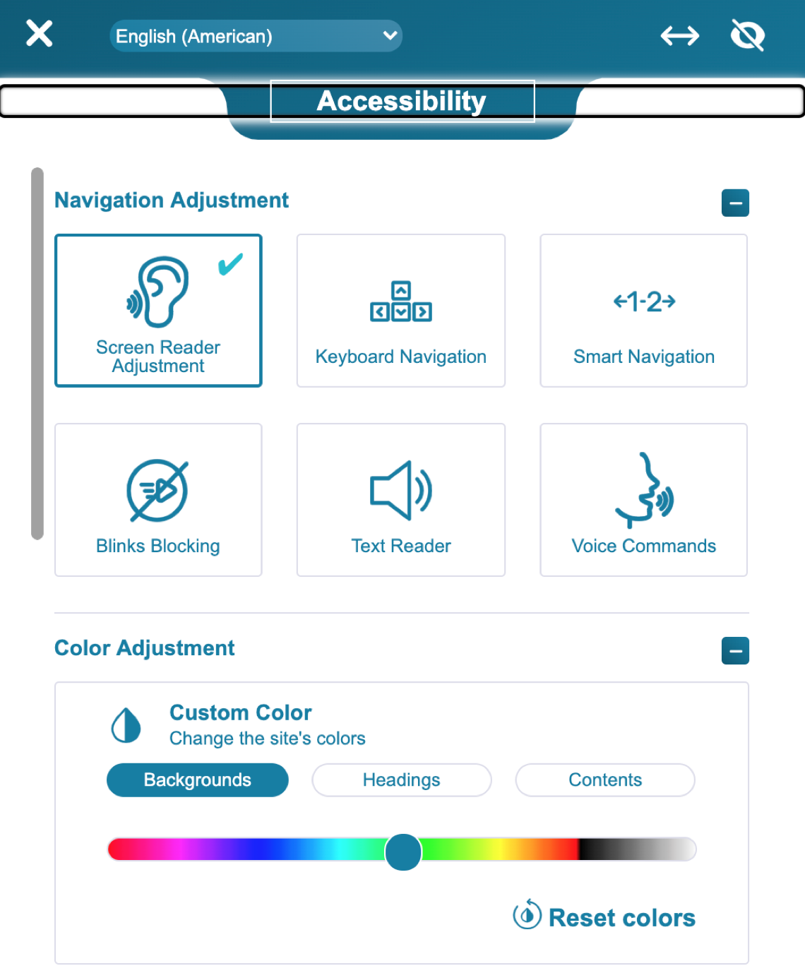
Source: Headspace.com
PRINCIPLE 2: GIVE CONTROL
All users should be in control. In other words, they need to have the possibility of interacting with your product in the way they prefer; nothing should be imposed. Maybe a few examples:
1. If you have videos or animations as a part of your product, disable auto-play
2. Avoid so-called infinite scrolling on your website or in your app
3. Enable adjusting visual elements, such as the orientation, font size, colours, zoom and contrast
This way, each user can “design” the perfect experience for themselves, and that’s what you want to achieve. Here, CBC is a good example. Their mobile app comes with dark mode and text resizing features. Additionally, they offer the “skip to content” feature that enables quick access to the main content on all their platforms.
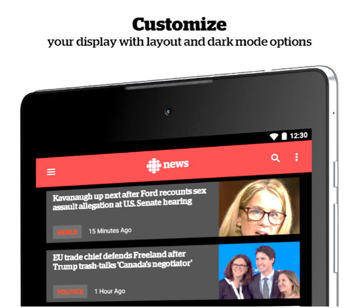
Image source: Play.google.com
PRINCIPLE 3: GIVE CHOICE
In short, provide alternatives for layout and task completion options. Here, generating the same information in different file formats is a perfect example. Some of your users will prefer Excel files, whereas others – a standard PDF file. Some will want to perform a given action in one way; others will choose something different. Here iPhone is a good example. This operating system enables users to open apps in three different ways:
- By clicking the app icon
- By saying the app’s name
- By typing the app’s name in the search box
And here’s another example: WhatsApp. This mobile messenger enables users to select the preferred skin tone when using human emojis:
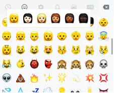
Image source: Techentice.com
Read also: Banking in Pandemic Times
PRINCIPLE 4: TAKE CIRCUMSTANCES INTO ACCOUNT
Products are being used in different conditions. Some of your customers use them at work, others at home or outdoors, or in public spaces. Take that into consideration. For instance, loud auto-play is a perfect example of a poor design. Your app should also offer high contrast options (so that it can be used outside), a reasonably large font and a clear typeface.
And here’s the other example – map applications. If you use them at home, you can focus on all the little details and many options, but when you drive a car, you don’t want to be distracted – the app has to be clear and easy to navigate (bigger buttons, visible instructions). Waze is a good example – this app blocks some of the functions when it detects that you’re driving a car.
PRINCIPLE 5: BE CONSISTENT
If you offer different versions of your product (or using different channels) make sure each version is consistent, offers the same functionality and is of the same quality. For example, your desktop and mobile website or app should have the same (or similar) layout and functionality. Here, Google Maps is a good example. You can use this service on your smartphone, tablet or PC, and it works the same every time. Compare desktop and mobile screen for the same feature – looking for a nearby store:
 |
 |
| Desktop version | Mobile version |
The goal is to help your users scan and navigate to key elements and content they’re after. If users have to “learn” each new channel, that’s not a good inclusive design practice.
PRINCIPLE 6: FOCUS ON CORE TASKS
Make sure your interface is intuitive for different users. Prioritise crucial elements so that people can concentrate on core tasks (and one task at a time). When designing a specific feature/product, consider its core functionality and focus on it. This way, people won’t feel lost using your product. Smartwatches are good examples – usually, they offer one function per screen so that users don’t have to think about where they are and what they should do next.

Image source: Samsung.com
Summary: opt for inclusive design
In today’s world, inclusive design is a smart and beneficial thing to do. That’s what consumers expect; that’s what makes them feel like they belong. And if you develop digital products, inclusive design isn’t as challenging as you think. It all starts with the right mindset – put your users at the very centre, think about their needs and preferences and make sure that your product reflects that comprehension.