
Outside-of-the-box approach to Credit Agricole’s mobile app design
What does it really mean to create a completely new banking application from scratch? What does the process look like, from the point of view of the external UX team, the banking project and the business team? How can we operate appropriate leadership and UX governance? The following case study is a story about what a modern banking application should be today and how to stand out from numerous fintechs and neo-banks. It is also a story about how to reconcile the user-centered design approach with the need to address the internal needs of a huge organization such as a bank.
-
Services
Services UX/UI Concept & Design, UX Research
-
Time
10 months
-
Type
Mobile application
-
Team
10 Designers
The situation
Up to now, Credit Agricole Bank Polska had a banking application for individual and corporate clients and separate applications for setting up individual and corporate accounts. For the bank, there was a need to build a tool from scratch that would support the new strategy, increase brand awareness and attract new customers. The existing bank application was designed a few years ago, based on past trends in banking and UX patterns, so it was at the end of the life cycle typical for digital banking products. In short – refreshment was not enough, only building from scratch would do.
Our role
-
1
Complex UX/UI
Efigence, with Credit Agricole Bank Polska, was responsible for creating the UX layer of the bank’s mobile app and managing the design process that would fit into the agile structure of the organization.
-
2
Discovery phase
One of our tasks was to conduct the Discovery phase, in which user needs and areas requiring changes were identified and a broad concept was created, covering most areas of the application.
-
3
Design phase
During the design phase, Efigence – together with the bank’s designers – designed all user paths and created a design system for digital products from scratch. It was also important to ensure appropriate leadership that would allow us to achieve consistency.
Objectives
After comparing users’ needs (confirmed by research) with the bank’s business goals, we selected a set of requirements:
-

Account creation processes
-
Personal finance management system
-
Highest user security
-
Acquisition and upselling space
-
Modern Design System
-
Everyday banking system
-
Contacting platform
-
Non-banking services
-
Discount program


Tools & frameworks
In the Concept and Discovery phases, the project was carried out using Efigence’s original design process (the Scattered Design Process), then the classic agile process, and the work and design teams were included in the bank’s squad structure, with the Efigence team maintaining a certain level of independence.
The process
Efigence got to work, blending in with the ready-made organizational structure created for this project – an agile organization divided into tribes, squads, etc.
An important task for us at this stage was to develop the design process and integrate it as smoothly as possible into a wider agile process (including parallel development) in which the organizational structure operated.
The Efigence team, consisting of around 10 designers and researchers, was dispersed throughout the squad structure. However, thanks to strong project leadership (an experienced Lead UX Designer + UX governance process) and the system of project rituals, it retained its independence and sense of action, on the one hand part of the banking team but on the other a strongly integrated but separate entity operating within a coherent UX strategy.
-
1
Discovery & Concept
-
2
Target Picture
-
3
Design System
-
4
All-hands-on-deck

“It was thanks to the joint work with Efigence and an orderly process that it was possible not only to achieve the set goals, but also to apply such innovative solutions in the banking application.”
Katarzyna Tomczyk-Czykier
Managing Director at Credit Bank Agricole

“It was thanks to the joint work with Efigence and an orderly process that it was possible not only to achieve the set goals, but also to apply such innovative solutions in the banking application.”
Paweł Haltof
Innovation Director
Our approach & results
The application has been divided into several functional areas reflected in the navigation. Importantly, the application can be used by both individual and corporate customers.
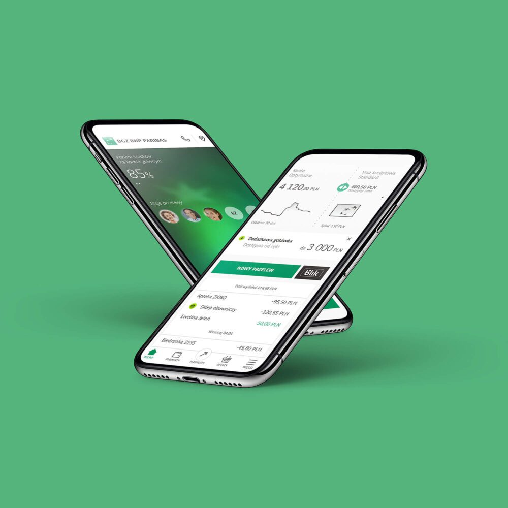
Dashboard
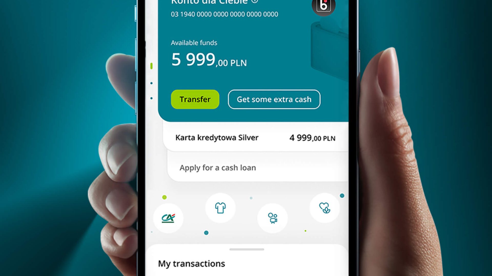
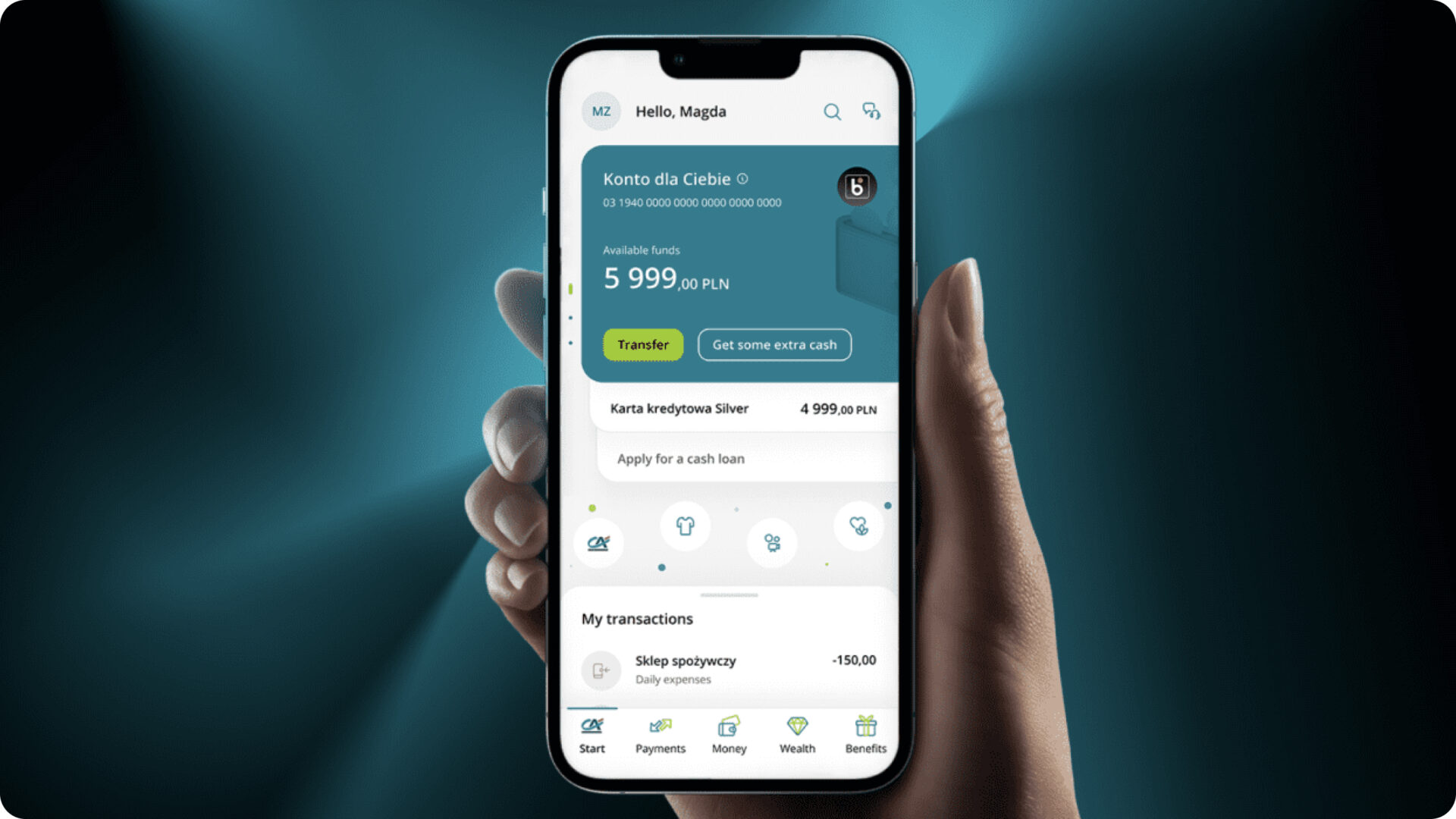
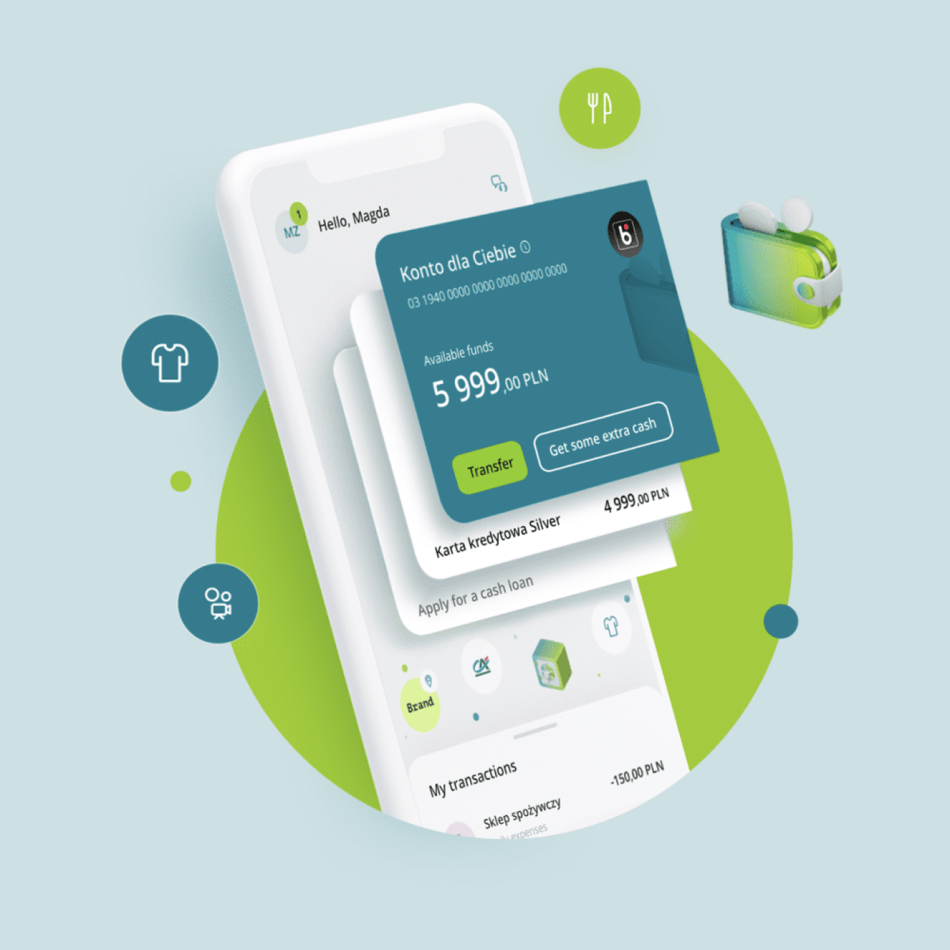
The Dashboard, to which users log in, on average, more than once a day (and therefore very often, in relation to other applications installed on the phone), was designed to provide full knowledge, at a glance, about changes in all a client’s important banking products, presenting details of balance and recent transactions.
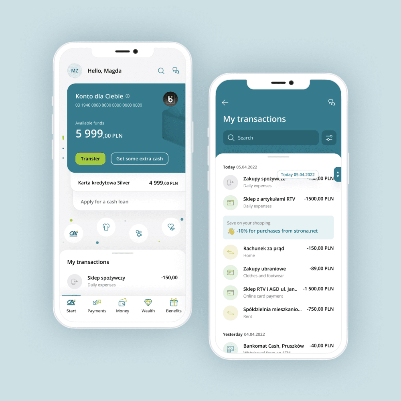
Smart Accordion
An innovative interface solution used was the so-called Smart Accordion, allowing for a quick overview of changes around the most important products, the ability to easily go deeper into information about a given service and the performing of key actions while providing space for promoting products. Thanks to the history organized in the form of a “drawer”, the user has a view of the last three transactions and can go to the full list (including search engine) with one touch.
River of Benefits
We also proposed placing a solution on the dashboard called the River of Benefits. It is an innovative approach to the presentation of offers from the bank’s discount club, as well as its own proposals.
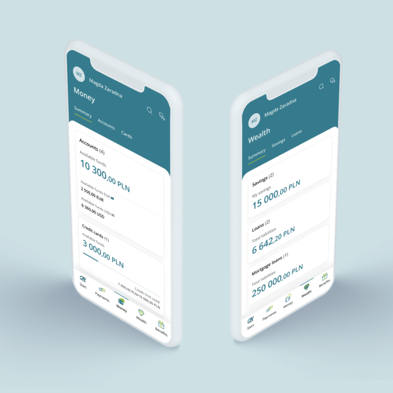
Banking products
Key areas of the application are banking products that have been organized into two separate tabs. Their inclusion is an innovative step resulting from customer needs.
Money tab
The tab compiles fast-changing products for everyday banking such as accounts, cards and everything else that we use here and now, every day.
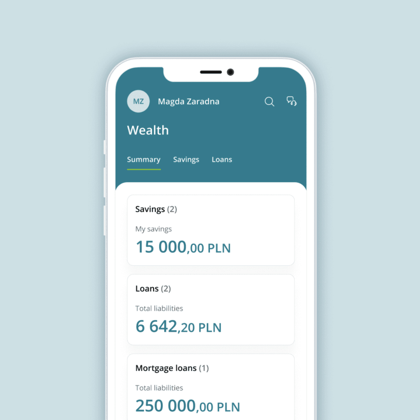
Assets tab
This tab stores all the resources such as funds frozen in the form of savings, investments and paid-off parts of property that can be used to increase wealth. In the future, we will also find tools to support clients in analyzing and planning expenses (the Personal Finance Manager).
Other important areas of the application
-
Account creation processes
The Dashboard, to which users log in, on average, more than once a day (and therefore very often, in relation to other applications installed on the phone), was designed to provide full knowledge, at a glance, about changes in all a client’s important banking products, presenting details of balance and recent transactions.
-
River of Benefits
We also proposed placing a solution on the dashboard called the River of Benefits. It is an innovative approach to the presentation of offers from the bank’s discount club, as well as its own proposals.
-
Smart Accordion
An innovative interface solution used was the so-called Smart Accordion, allowing for a quick overview of changes around the most important products and the performing of key actions while providing space for promoting products. Thanks to the history organized in the form of a “drawer”, the user has a view of the last three transactions and can go to the full list with one touch.
-
Banking products
Key areas of the application are banking products that have been organized into two separate tabs. Their inclusion is an innovative step resulting from customer needs.
The CA24 Mobile application is a good example of a bank going beyond the area directly related to banking and connecting various spheres of customer life. In addition, the numbers speak for themselves – the new Credit Agricole Bank Polska application currently has 582,000 active users – and their volume is constantly growing.
Related case studies
Let’s Talk
Rafał Ochmański
Key Account Manager