
PeoPay 4.0 app: creating innovative solutions focused on personalization and adaptation to the digital-savvy generation’s needs
By PeoPay 4.0, we wanted to attract a new target group – younger people who actively use the online and mobile environment. We know that they don’t fear innovations – they love them. At the same time, we couldn’t also forget about those outside this group, a little more conservative but equally crucial for Bank Pekao.
-
Services
UX/UI Design, UX Research
-
Time
8 months
-
Type
Mobile application
-
Team
4 Designers
The situation
Bank Pekao SA (formally Bank Polska Kasa Opieki Spółka Akcyjna) belongs to the group of the longest-standing Polish banks. It was formally established in 1929. Pekao PeoPay is one of Poland’s most frequently chosen mobile banking apps. So far, 2 million users have used it. However, Pekao SA is a player with a strong group of conservative customers – traditionalists and representatives of the older generation. This type of customer has relatively low digital skills, and they regard mobile banking applications with a sense of distrust. At the same time, they are very attached to the solutions that they know and do not like changes, especially in the digital environment. Therefore, our primary goal with this assignment was to build a completely new, experience-oriented application that would satisfy the current customer base and attract a new group of younger, tech-savvy potential customers.
The Challenge
At the beginning of the project, our team classified four primary areas targeted within the application: the needs of mobile-only customers, which should be acknowledged; the banking branch embedded within the app; the prizing of experience over products; and extending banking with non-banking services.
-
1
The new target group
-
2
Perfectly suited for every user
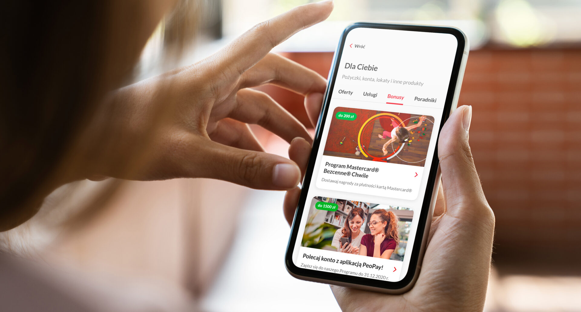
Last but not least, our task was to increase sales of banking products. And from practice, we knew that the banking app could achieve this by activating users to access it more frequently. So we needed to extend the offer with non-banking services (VAS) directly from the PeoPay app. This is in line with the theory that banking apps are heading toward becoming super-apps, a concept that visualizes the banking app as a hub for various services that make everyday life easier and are not directly related to managing money.
Our approach & solution
When designing the new PeoPay 4.0 application, we have always kept our new target group at the center of our hearts. This audience grew used to the most prominent social media applications and their way of serving content. Our team set up the whole process, starting with benchmarking to see what solutions are used by other players, fin-tech, traditional banks, and the most utilized apps from Polish and European markets. Following gathered guidelines, our strategic UX team started almost immediately to create the initial product concept. The first screen and sketches followed by user flow aimed to cover the most critical parts of business challenges – the pre-login screen, onboarding, dashboard with customizable widgets, cross-selling features, and personal assistant. Once finalized, reviewed and accepted, we carried out the following UX and UI steps based on the Scrum framework as part of a more extensive agile community within the Bank.
We conducted usability tests and qualitative research.
The former took place throughout the whole process and followed the RITE (Rapid Iterative Testing and Evaluation) method. Our research team invited Pekao’s customers, who also have accounts in other banks, to verify our concept at each stage of its creation. We concentrated on a different area of the new PeoPay app during each testing slot. After that, the design team improved the UI/UX concept based on key observations and recommendations.
During qualitative research, users familiarized themselves with a relatively complete product (the main areas of the application presented the final UI layer). Thanks to this, stakeholders, creators of the application, and respondents had the feeling of using an almost final version of the application.

“It was a great pleasure to work on this project in such a UX team – with a partner who knows all of our customer types’ needs and represents out-of-the-box thinking at every level of the process. Premium UX combined with the power of personalization results in a modern, pleasant-to-use tool that reflects essential mobile-only users’ needs. “
Michał Ornatowski
Lead of Alternative Payments and Value-Added Services

“Supersmooth cooperation with the client, high UX maturity by the organization and – most importantly – a unique dose of mutual trust resulted in great effects. We created an application that is easy to use, reflects a user’s sense of security and supports the daily struggle with the complexities of financial life. The last, but not the least important aspect is the fact that the application gives customers such pleasure of use, confirmed by comments and during research. In today’s financial reality, this is neither an obvious criterion nor an easy-to-achieve goal.”
Eryk Orłowski
Design Manager
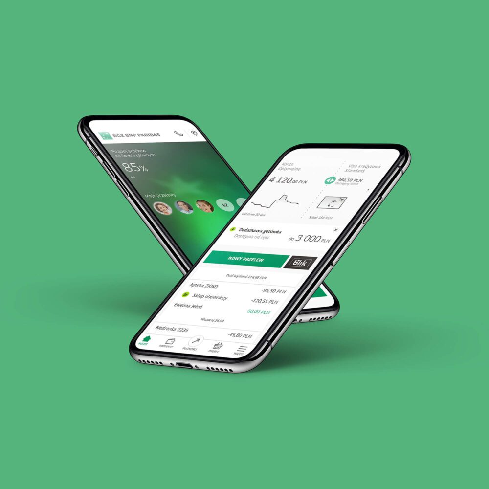
Five main areas of strategic UI/UX in the new PeoPay 4.0 app
When designing such a widely used application as PeoPay, we knew that the whole process should come naturally as an evolution – not a revolution. As a result, the new UI/UX is easy to understand and interacted with by both older and younger users. Furthermore, the whole solution meets the high standards of WCAG readability. Here are the five most important areas of the new application redesigned by our strategic UI/UX team.
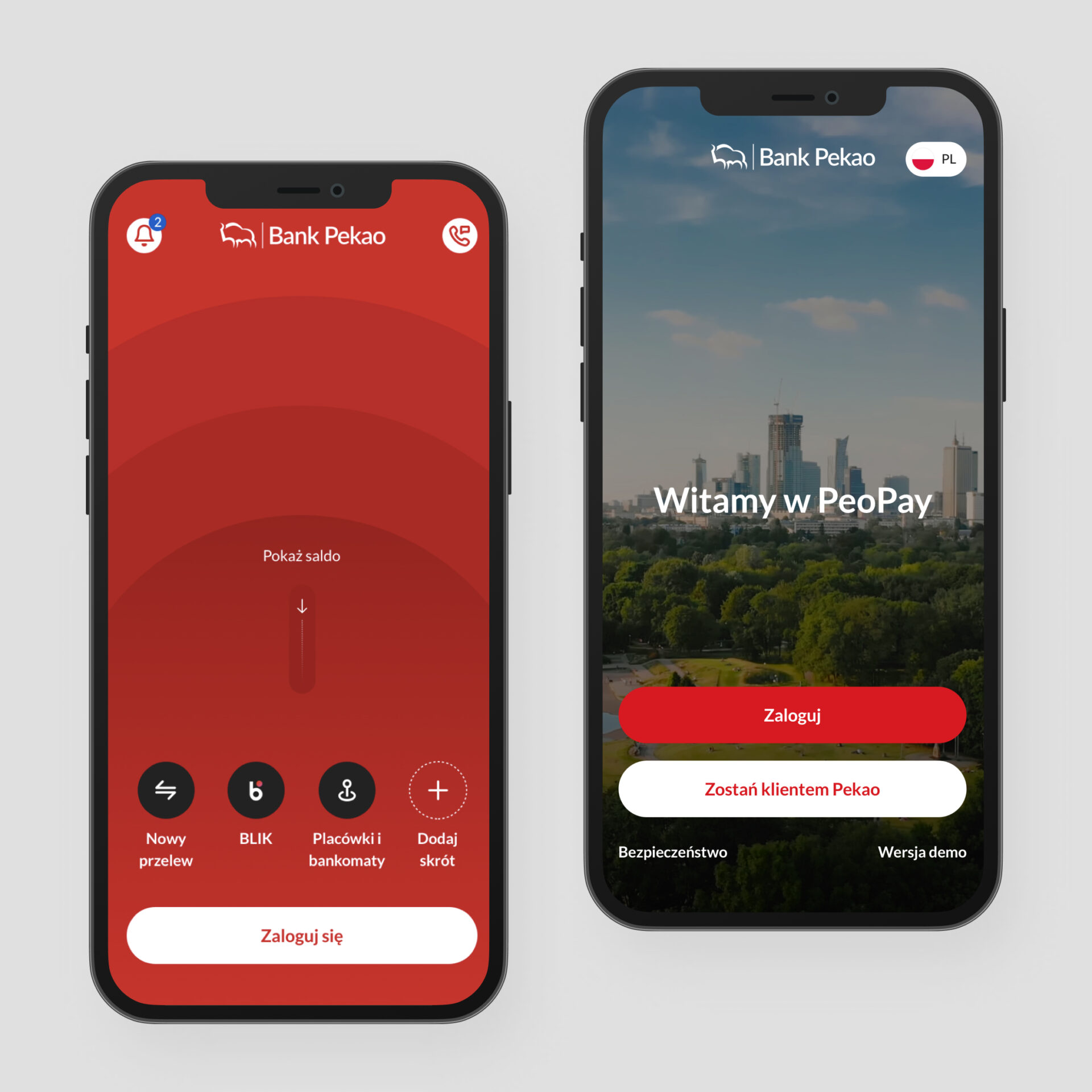
Welcome screen
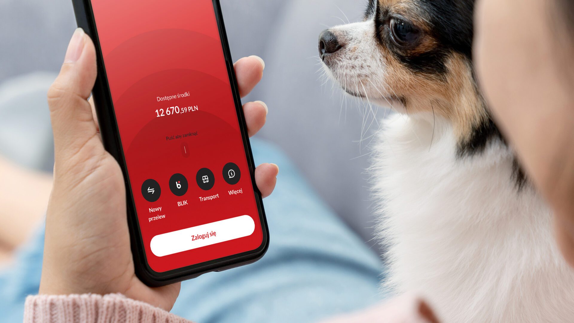
We wanted PeoPay users to log in more than once a day – only social media apps are more popular than banking apps. Therefore, we decided to redesign and optimize the welcome screen (sometimes referred to as a login screen). Our idea was to give users access to features such as a new transfer, check of available funds, Blik (a Polish method of fast and easy money transfers and payments), parking and highway fees, or buying tickets for public transport. The advantage of the welcome screen is that it concentrates the users’ attention – the user focuses only on a small part of the application features, the ones most important to them.
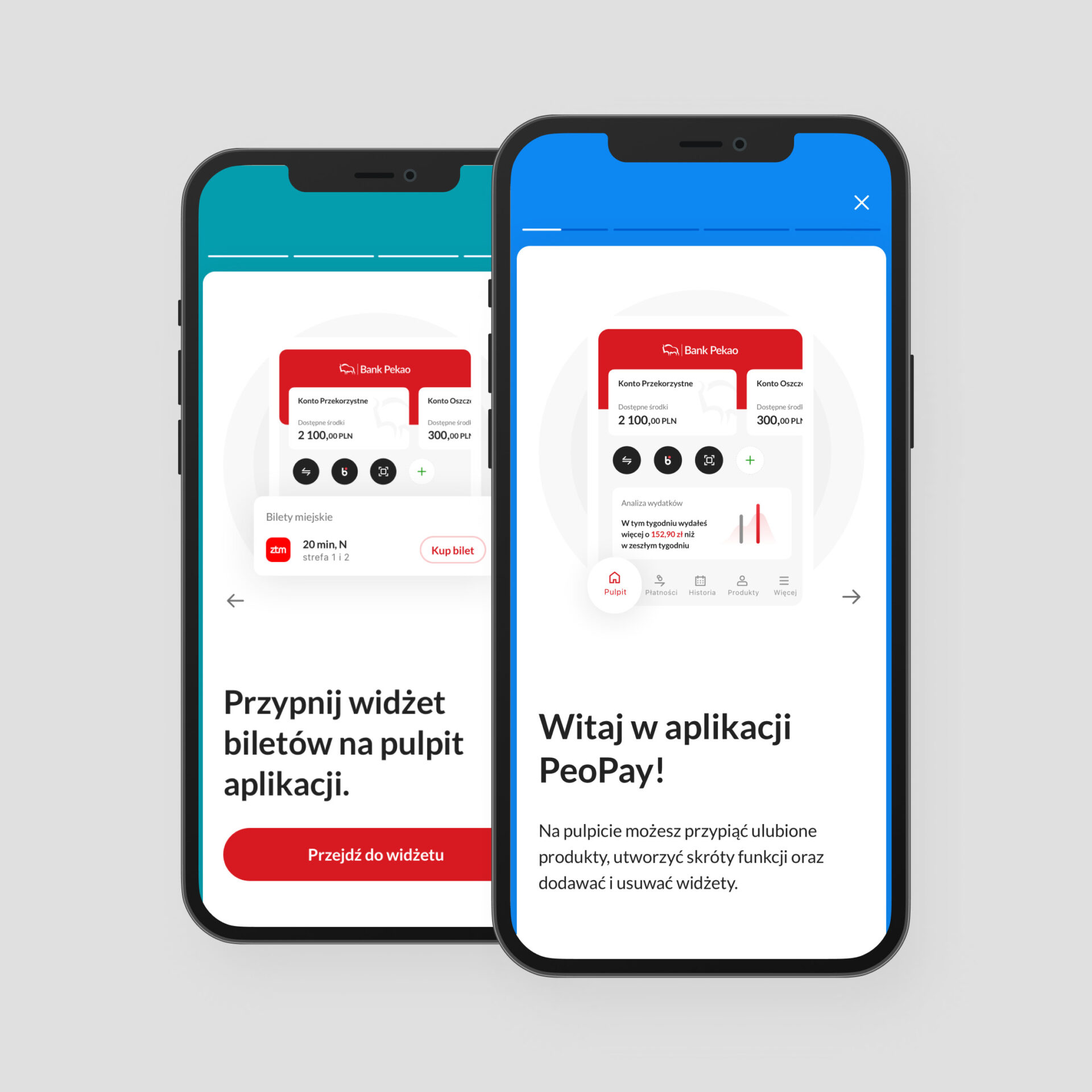
Onboarding process
An important assumption was to support the user at every stage, especially when being greeted as a new Pekao customer. In addition, onboarding aims to increase the sense of security, which could drop quickly and drastically when facing issues connected to interacting with banking processes. We also introduced quick onboarding dedicated to the existing customers switching from the older version of the application. And all of this with simple and friendly UX.
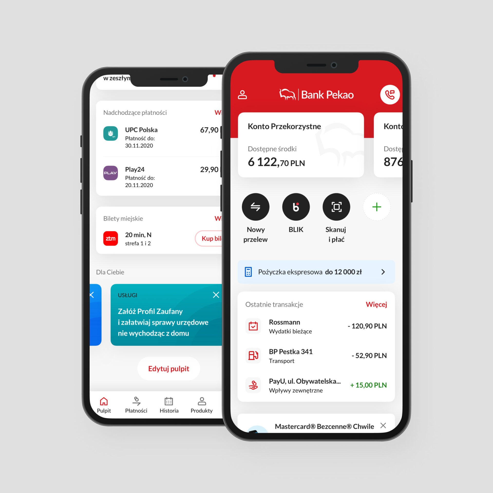
Dashboard
Our first resolution for the dashboard was full support for daily banking scenarios. One of the critical goals was to provide users with what they most often log in to see – current information. In the case of a banking app, this means information about the current balance and a preview of recent transactions. Efigence designers constructed the dashboard so that customers could quickly consume this fresh content. Instead of complicated analyses, we present the user with processed data in an attractive and straightforward form, allowing them to analyze finances and providing help with savings, as we are also pursuing the goal of educating Pekao customers about finances. Users can also personalize the layouts by adding and deleting widgets. Our research showed that customization was essential for some users as it increased their sense of control. The concept of a very long, scrolled dashboard and the widget configuration mechanism was well perceived by the users and quickly adapted.
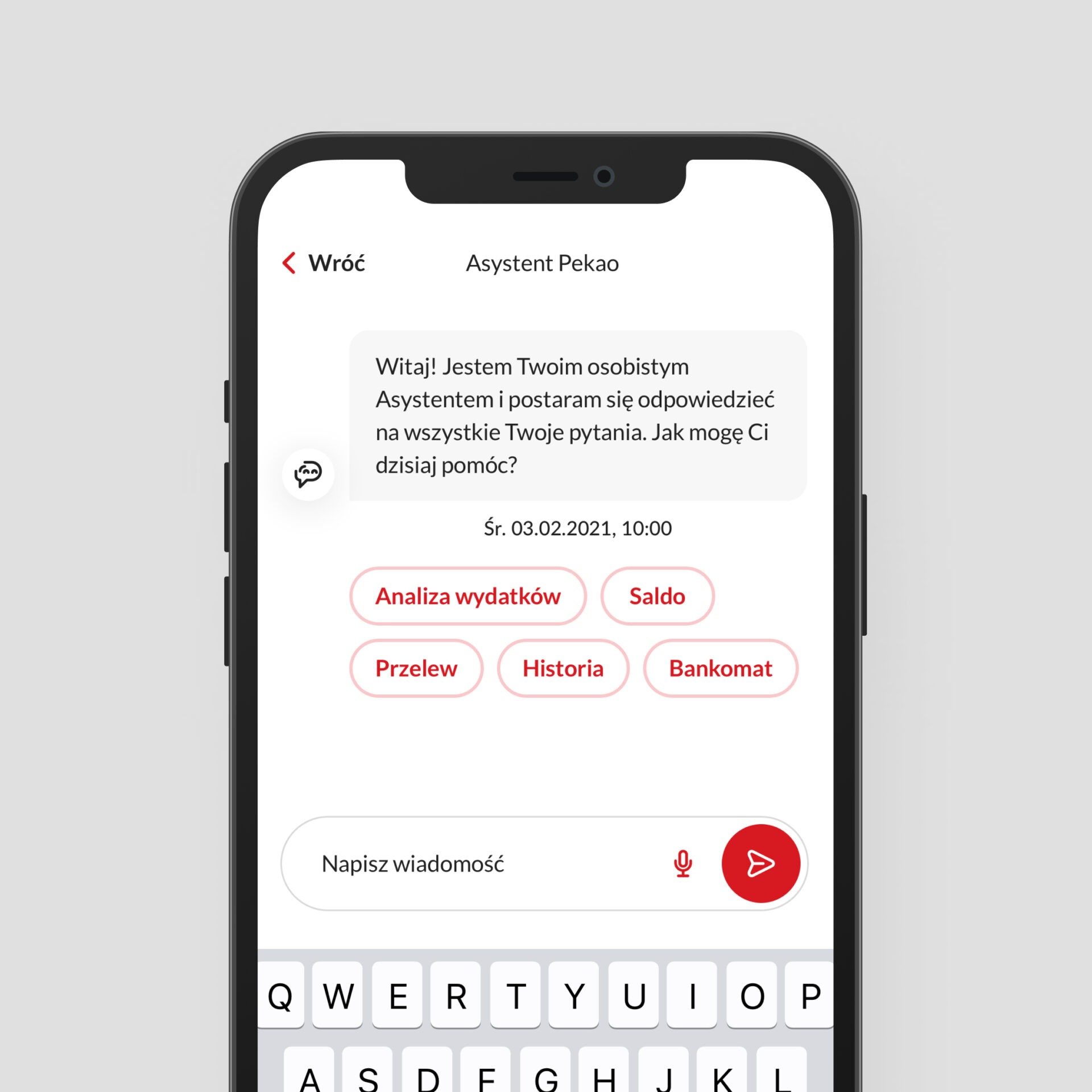
Communication – Pekao chat assistant
The new application offers constant access to the Pekao Assistant in chat form. This context-aware functionality is always relevant to the current area seen by the user in the application. A personal assistant, an intelligent contact channel, provides the possibility of contact at any suitable time without involving a consultant. Users can write down their questions or even enter a voice command. This solution also supports cross-selling activities.
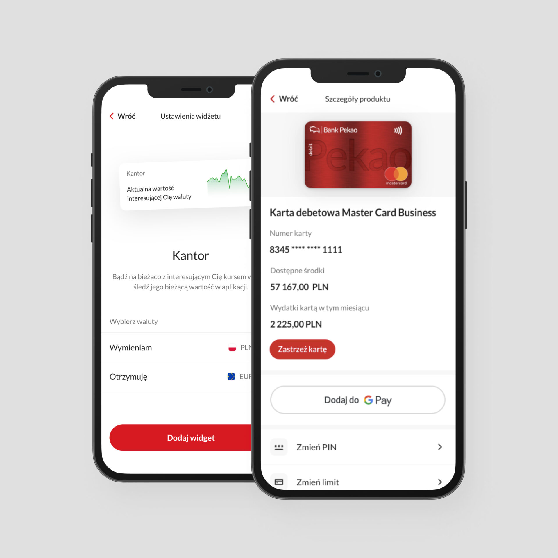
Design system
One of our main tasks was to build a consistent design system that should serve such a large organization for several years. According to our standards, the process of design system creation starts simultaneously with the development of user flows. Therefore, we could quickly create a set of components by using a quasi-final interface during the concept stage. Thanks to this approach, the nest areas of the app were built using an incrementally created design system, avoiding lo-fi mockups.
Executive summary
Pekao PeoPay 4.0 is an entirely new approach to the area of prospect acquisition. The application optimally serves both current, and older-generation customers, and attracts tech-savvy young users. Our approach for benchmarking, creating the concept, strategic UI/UX and user testing provided the whole development project with the best possible results. Redesigned areas – the welcome screen, onboarding process, dashboard, chat assistant, and design system will serve for many years to come as new market best practices for others to follow.
Related case studies
Discover how we’ve helped our clients.
Let’s Talk
Rafał Ochmański
Key Account Manager